
As part of our digital accessibility campaign #MakeTheWebAccessible, PFR are partnering up with organisations and bloggers. Today’s guest is Digital Product Specialist Fritz von Runte.
If you have ever tested your product (website, app, system) with a genuine user, you’ll know that errors occur. Some of these errors are intersected with the subject of accessibility, and they could be easily avoided (or solved, after a testing session).
Accessibility is not a luxury, far from it. Accessibility is a fundamental principle in digital product development. And it’s not for a sector of the user base, it is for everyone. It’s important that we put those points across when talking about it because the general perception – especially from those who aren’t designers or developers – is that “it’s something extra we do to help people with severe disabilities”.
I heard that quote once. Big mistake. Big mistakes.
Accessibility isn’t something extra
Thinking about accessibility from the beginning is paramount. It not only saves time and money but it also helps define the project. For example if you’re designing for a browser, understanding basic design patterns helps a lot. The difference between radio button and check mark does have an effect on how people interact with the interface. Also, most of the work is done already by browsers – if your markup is correct, and you’re not messing about too much with JS and CSS you’re golden. Just follow the standards.
Accessibility isn’t there to help
A bedroom door is not there to help you enter the room. Without it you wouldn’t be able to enter it in the first place. This is a bit like accessibility. Without a clear path to completion of a form, someone may not be able to finish it.
Accessibility isn’t for people with severe disabilities
I think this is the mindset we need to change the most. Accessibility is about including the most amount of people possible, and it’s not directed only to people with certain disabilities. Making your copy simpler, helps a variety of people to access your product that may not have any disability whatsoever. Affordance and contrast in buttons are not superfluous, they are quite important. Discussing legibility isn’t trite. Colour balance and contrast are not banal.
One in nine of us have some sort of dyslexia; most of us, undiagnosed. We carry on living our lives, but certain things are easier or harder than others. Making it clear to everyone what the path to completion is, is a duty we as designers have to do. It’s not only for people with dyslexia, mild or not.
We’re all lacking time these days; a fast completion sometimes is a need. Make sure you do some colour scheme analysis and understand what colour combinations from your brand guidelines provide the biggest contrast, and what other colours provide less. Use those elements deliberately, to define hierarchy and to guide the user on what’s more important for the action that they want to do.
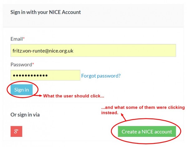
Example on the right: call-to-actions. If you highlight everything you’re not highlighting anything as they say. In this example, we saw a significant number of people clicking on the green button, when they really wanted to click on the red one. They’d complete the form, and immediately go to the green one.
One story I have is about a form design I was involved in for a car financing company, that was inherited to us without standard in terms of markup and CSS. That was causing navigation via tab key to break. The team was (rightfully) trying to do it properly and that would take a day or two. When prompted by the effects of having a non-standard form, someone said: “blind people rely heavily on this standard so their browser reader allows them to use the interface”. That was it. The person in charge then said no to the unexpected piece of work because “blind people don’t buy cars”.
If that’s revolting to you, you’re not alone. Fighting the good fight of accessibility involves being knowledgeable and knowing the right arguments. When one says you’re doing something to help the blind, or any other subgroup of people, you’re giving them an excuse to ponder if excluding this subgroup is viable, or if the effort to include the is worth it. And accessibility is about inclusion, not exclusion.
If you would like to find out more about our in-house participant recruitment service for user testing or market research get in touch on 0117 921 0008 or info@peopleforresearch.co.uk.
At People for Research, we recruit participants for UX and usability testing and market research. We work with award winning UX agencies across the UK and partner up with a number of end clients who are leading the way with in-house user experience and insight.